Click & Ship
Rewriting the rules of last-mile



Challenge
Quote, generate, track. That is the pitch of every shipping platform in Mexico. The entrepreneur looking for a logistics solution finds dozens of options using the same words, the same tone, the same promise of simplicity. Click & Ship had something its competitors did not: owned warehouses, a fleet, a team of real people who answer the phone. None of that existed as a brand. None of it had a name.
Working with Arctic Fever was an excellent experience. Their team accompanied us through the entire process of creating and developing the Click & Ship brand, from naming and logo design to the website and platform. A highly recommended team for any brand project.
–
Cesar Villarreal, Director, Click & Ship


Strategy
In categories where the product looks identical, positioning does not live in the features. It lives in what is underneath. Click & Ship does not compete on price or coverage. It competes on what no app alone can offer: physical backing, real scale, human service. The strategic work was making that tangible before a user ever opened an account.

Approach
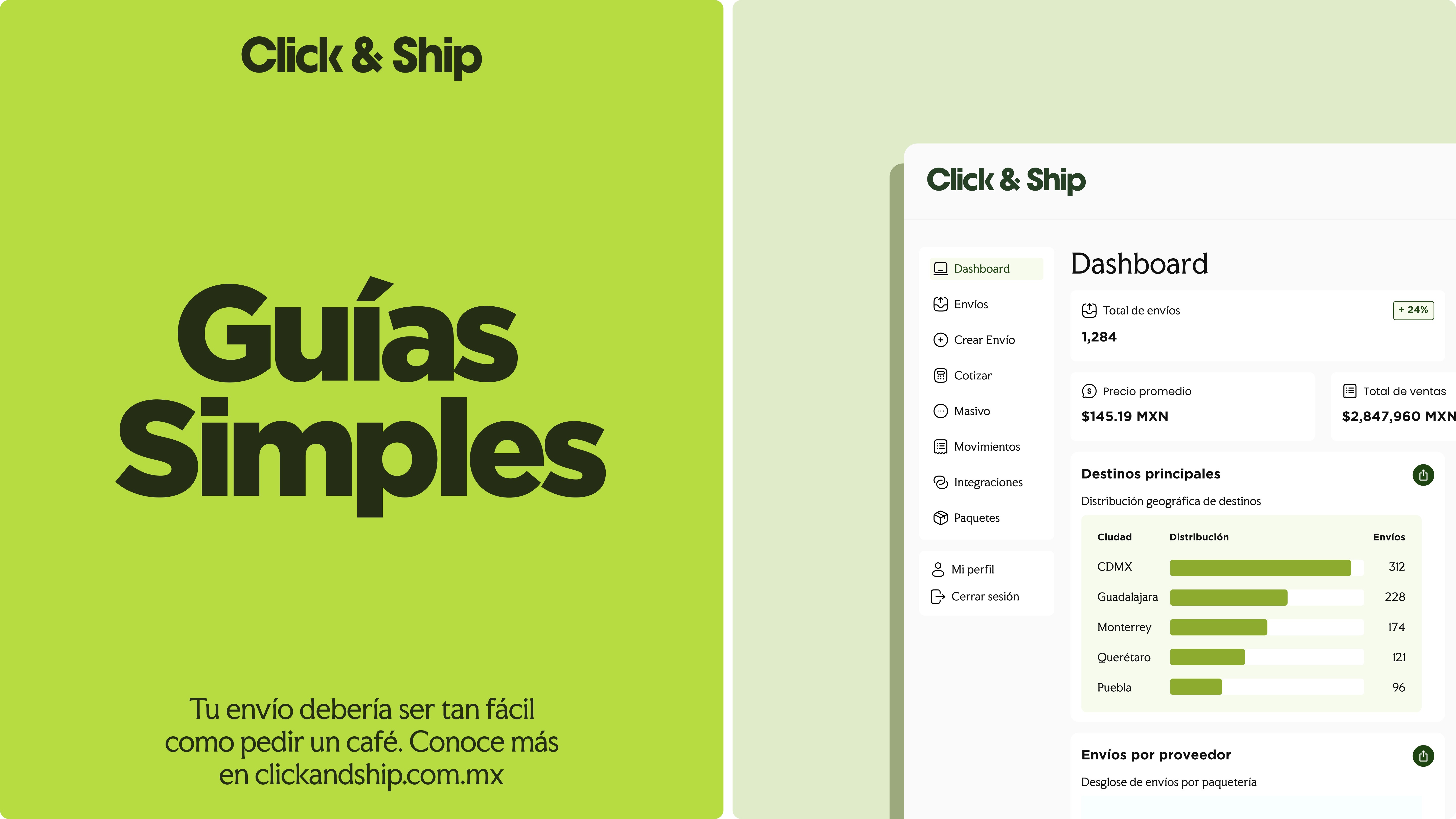
Starting with the name. Click & Ship does work in two words: it describes the action, compresses the promise, and operates equally in Spanish and English inside a market that lives in both. The identity was built for high-friction contexts: an 11pm notification, a shipping label in a warehouse, a dashboard with a hundred active orders. The communication tone was written for the entrepreneur who has no time to read, but every reason to trust. Direct, no jargon, urgency without anxiety. The UX followed the same premise: the fewest possible steps between the decision to ship and the label generated.

Visual System
A logistics brand does not live in presentations. It lives on 10×15 labels, tracking status updates, automated emails, and 375px screens. The visual system was built to survive those contexts without losing coherence: high-legibility typography, a palette that distinguishes without decorating, custom iconography for each step of the operational flow. Nothing in the system exists for aesthetic reasons. Everything exists because the user needs to understand something fast.
The competition was selling technology. Click & Ship had real operations. That difference was the only place worth building from.
–
Esteban Villarreal, Director, Arctic Fever

![[ArcaContinental][Technology, SaaS][Banner, Logo]](https://framerusercontent.com/images/iJo7SUPoqncnU15hVTcX5I6o0Xk.jpg?width=3240&height=3240)


